Find 2 examples of good user interface design, and 2 examples of bad user interface design.
Your examples should be specific. It's very hard to find a large interface that's completely good or completely bad, so don't try. Instead, focus on a particular feature or aspect of a user interface that makes your case. Avoid fuzzy words like “intuitive” and “user-friendly”. Find concrete reasons for your judgment.
You aren't limited to desktop software. Web sites offer many great candidates for fame and shame. You aren't even limited to traditional computer interfaces. Feel free to go out into the real world, and consider consumer appliances, car dashboards, building entrances, traffic intersections, shower controls, etc. (Norman's book Design of Everyday Things includes a lot of examples of this kind, which you may find inspirational.)
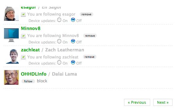
UI For Pagination (The user needs to view a subset of sorted data that is not easily displayed on one page.) This is how twitter design the UI for pagination.


This bad because there's no links to specific pages by number. User have to go Next or Previous several times to find the right pages.
Suggestion: When providing a user interface for content pagination, always provide a previous page link, a next page link, and links to the specific pages by number.
Elevator Interface. The elevator button suppose to take you where you want. This is seen at JFK airport Terminal 2 in New York,
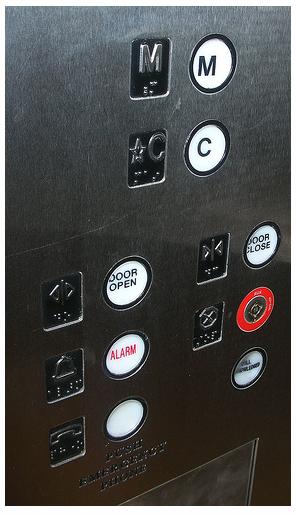
The elevator provide just two options: "M" and "C" while there are more than two floors at the JFK terminal> The user will not know where this elevator will go when the press the button.For user who speaks english and travel a lot that they are familiar with airport, "C" could be "Concourse" or "Crown Club", which are in fact the two ends of the route. "M" could be "Main Level" or "Mezzanine," which are in fact the two ends of the route. But for those who don't - which is often the case for passengers at one of the world's largest international airports, you cannot even guess that your options are "Concourse," "Club," "Main," or "Mezzanine," even if you knew where you started.
This is a good example for UI for Pagination.
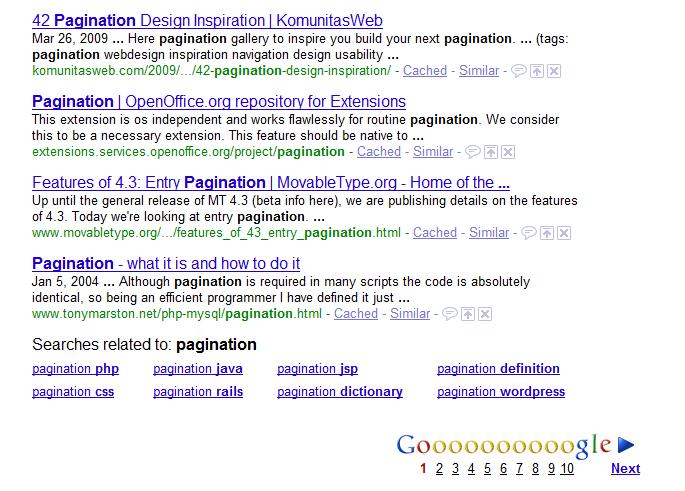
It has a previous page link, a next page link, and links to the specific pages by number.
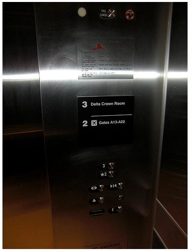
This is a better elevator UI, seen at the Delta Crown Club in Boston's Logan Airport
